STARZ - UX and Design Ops
STARZ has about 600 employees at multiple locations across the US. In addition to employing a team of designers and developers for upkeep of the official STARZ mobile app, they also employ a team to update and maintain their own internal applications - proprietary software that allows STARZ to manage or automate tasks like content procurement, quality assurance, licensing, and editing.
When I was hired at STARZ in 2021, I was the first and only UX designer on the STARZ internal applications team, and the application production process was driven by developers. My first challenge was to sell the UX process to our development teams and application users, to get them onboard with longer discovery and research cycles, and to introduce them to the concept of low-fidelity wireframes and prototypes as a way to solve problems before they get to development.
Accomplishments
During my 2.5 years at STARZ, I worked with product owners, users, and developers to design, build, and maintain 5 separate applications for STARZ internal use. I also created a brand new design system for future applications, and a Dark Mode for our light-sensitive users.
5 Enterprise Applications
New Design System
Night Mode for Edit Bays
QC Review App
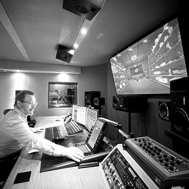
My most involved project at STARZ, the QC Review application was a dashboard used to document any production or file errors within STARZ movie and tv content. STARZ employees would use the app while watching content in darkened editing booths and note any issue that needed addressing like accidental interruptions from boom mics or mismatched subtitle files.
PROBLEM(s)
On an application level, the UI for this tool was dated and unmaintained, and users frequently complained about excessive scrolling, data entry conflicts between users, and misuse of responsive screen space. As my team started our UX discovery, another key problem emerged: STARZ needed a Dark Mode. The UI kits and Figma components we had built over the previous few years were all in light mode, and did not address the unique need that our QC review team had in their darkened editing bays.
APPROACH
My preferred UX approach is user-centered and research-driven, so I was thrilled when STARZ gave me direct access to users and plenty of research tools for our discovery phase. I started by walking users through a heuristic evaluation of the UI, and prioritizing some concern areas.
Next, we collaborated on low-fidelity wireframes, to confirm our users were using the space the way we expected. For this project, we focused very heavily on documenting screen resolutions, orientations, and on-screen layout to make sure we offered a solution that didn’t interrupt our user’s existing workflows.
Finally, we did intensive usability testing using Figma Prototyping features to simulate the final product as much as possible for our users. We recorded our usability tests and collected data as validation or constructive feedback for our final review.
The original UI made it difficult to navigate, distinguish priorities, or follow common workflows across teams.
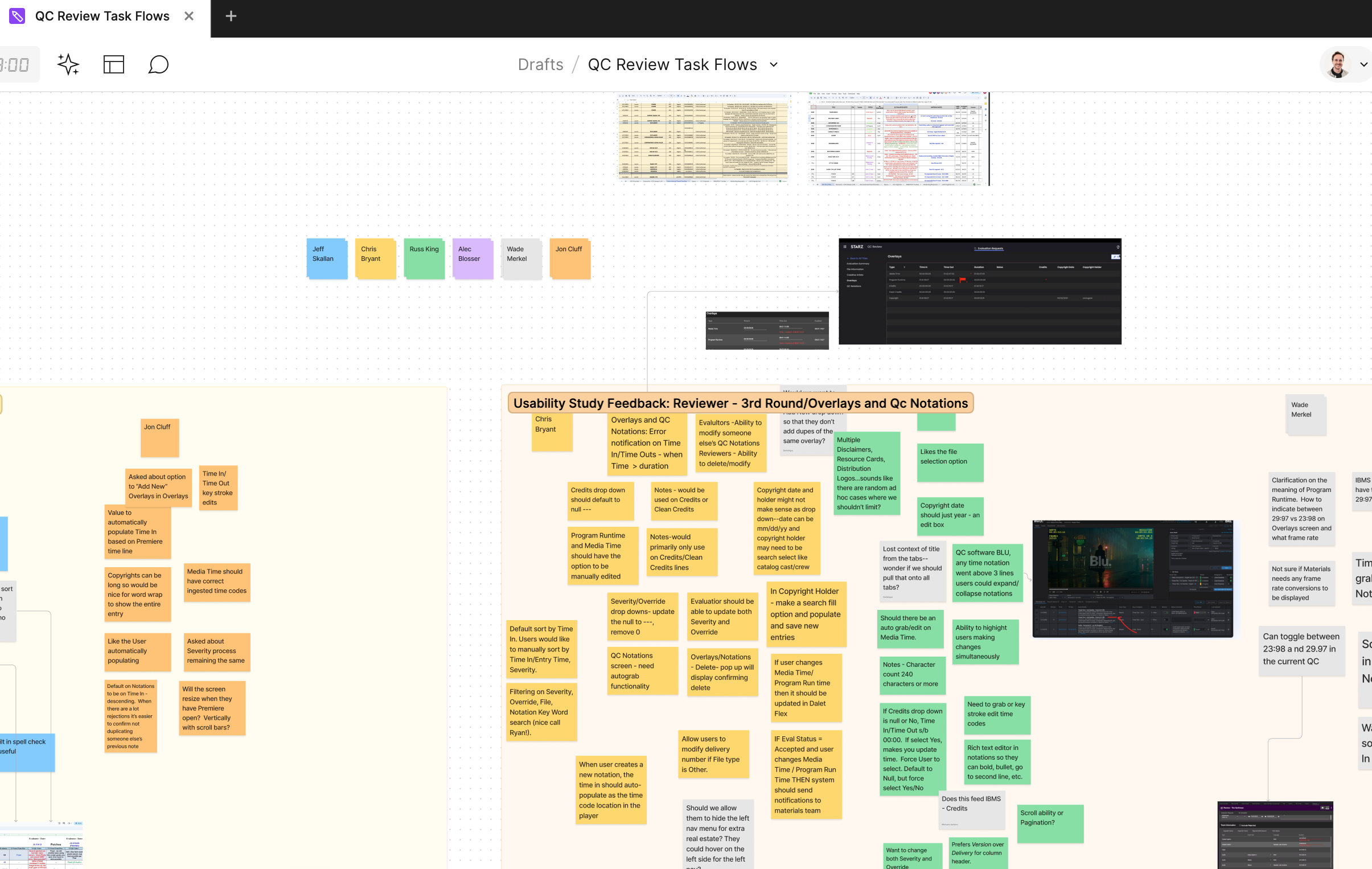
Figjam collaborative whiteboards allowed us to get direct feedback from users and gave users a view into our UX workflow, which made our final onboarding process quick and painless.
QC REVIEW SOLUTIONS
While simultaneously developing a new design system and dark mode, I designed a completely new UI for the QC Review team, updating their original features, and adding new and helpful features like commenting, responsive layout, and a color-coordinated workflow status system.
Users and business stakeholders were pleased, reporting up to 10 hours a week of recovered time after the application update, and developers and UX designers reported a up to a week less development time after creating a shared design system.
Additional Applications
Apple Live Feed
Apple Live Feed was a dashboard that STARZ employees used manage content sent to AppleTV. When the UX team was given this project, the workflow was completely manual. My team automated the solution, and built a temporary UI for error-handling. Apple Live Feed was a quick turnaround, designs and development occurred over 6 weeks.
Curator
The content licensing teams at STARZ had built their own system of complicated Excel sheets and CSV macros to solve their data management problem. I dug deep into the workflows they had built for themselves and designed an innovative and intuitive UI that increased efficiency and cross-department collaboration and introduced drag and drop interactions to our applications. This was a project took us about for months from discovery to initial launch.
Partner Overrides
This dashboard managed the highly complicated process that STARZ used to categorize it’s content for multiple markets and regions. Our challenge as a UX team was to simplify the user interactions without taking away the detailed-level of customization they needed to accomplish their job. Launched in 3 months.
Design System and Operations
In early 2023, Figma released new features allowing for better management of design tokens. Design tokens are groups of data that represent design decisions - color, spacing, font-size, line-width - and can be repeatedly used within a design system. Establishing rules in the form of tokens not only made our design experience easier, but since we were now able to export those rules into code snippets, it made our development experience easier as well. I used those tokens to integrate our Figma-based design system into our developers existing stylesheets, making our code and designs perfectly representative of each other.
As part of this process, we developed a “Dark Mode” UI that was previewable within Figma, and used to re-skin our editing tools, for users that worked in low-light editing booths.
Skills
UX Strategy
UI design
Design Operations
Design System Development
Figma Prototyping & Whiteboarding


